Case Study: Leganto User Testing
In the fall of 2023, Drexel University Libraries began the process of transitioning their course reserves management system from the Atlas system Ares, to the ExLibris system Leganto. If you are unfamiliar with course reserves, it is a system many academic libraries employ to allow them to upload electronic materials the libraries license directly into university courses, as well as the purchase of required course books that can be kept at the library.
Our team conducted a round of faculty interviews, as well as a round of faculty user testing with our new system so that we could make it as easy-to-use as possible.
Overview
- Software: Miro
- Methods & Materials: Interviews, Affinity Diagramming, and Usability Tests
- Deliverables: a list of actionable recommendations, organized as high-priority and low-priority
- Time Frame: 2 months* (not sequential)
- People Involved: 3 designers
- My Role: Lead Interviewer
Challenge
- Faculty expectations. Faculty (and their course assistants) are the main user group for this software, and their feedback was essential to understand how best to customize the interface and workflows within Leganto. However, only so much is customizable within the new system - so it was a challenge for the team and I to garner feedback, while setting realistic expectations for what the new system would be able to do.
Initial Interviews
As the lead interviewer, I conducted all initial interviews in the fall with about five faculty members, to get a sense of how they feel about course reserves. Some of the questions asked were:
- How often do you use course reserves?
- What do you like about the current course reserves process?
- What do you dislike about the current course reserves process?
- What aspect of course reserves services do you find the most helpful?
- Can you tell me about a time when you had a frustrating experience with course reserves?
I also showed them a brief into video on what Leganto looks like, and how it functions.

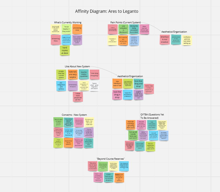
Once I gathered the feedback from all of our interviews, I wrote down the most important pieces on sticky notes within a Miroboard. I then separated the info into five different categories (seen above): What's Currently Working, Pain Points, Likes About the New System, Concerns About the New System, QYTBA (Questions Yet To Be Answered), and Beyond Course Reserves.
Check out the full Miroboard here.
I wanted faculty to know that while we couldn't make over-the-top promises about a new system, we were listening to their concerns and taking their input seriously.
Essentially, what I found was that faculty had an overall positive view of reserves - which was a great base to build upon. Additionally, they were collectively very excited about the new system, based solely on what they'd seen in the brief video. One user even claimed that comparing the old system to the new was like comparing a bicycle to a sports car! I made sure to include this in the start of the initial findings report.
Naturally though, the faculty interviewed did have some concerns. Many of these concerns boiled down to two things. One: the interface. Leganto is advertised as fairly customizable, but this made some worry that it would be far more complicated to navigate than they were used to. Would things take longer to process? Would there be training webinars or materials available?
The other major concern? The people behind-the-scenes. Many faculty asked, will there still be humans running this system? And will it be easy to contact them? (The answer to this was of course, yes. But it brought up the fact that this needed to be made clear once the new system was installed.)
Next Steps
I presented my findings with the Miroboard to the group soon after. We agreed that we felt ready to move forward with a more concrete idea of what to keep in mind when customizing our Leganto interface, when the time came.
Finally, in the new year, our paperwork was signed, we were assigned a rep, and were given access to our testing environment in Leganto. Our project manager took care of the initial customization, and made decisions keeping our faculty's concerns and priorities in mind.
During this time, two of the other designers on the team came together and formulated the user test that I would conduct with three volunteer faculty members to get an idea of any major changes needed to be made before the system went live. The six tasks of the user test developed were:
- Find the link to Leganto in BBLearn. We want to know if users are able to easily locate the tool link in Blackboard Learn (Drexel's CMS), based on its name and location.
- Create a reading list in BBLearn. We then want to observe if users are able to create a reading list within the new system.
- Add an online journal article. Users are next tasked with adding a commonly-requested item type to their reading list: an academic article.
- Add a request to have a DVD streamed. Users are also tasked with another common item request, a streamed film.
- Add a request to have a book purchased. Users then will demonstrate if they are able to submit a request for a new item, a common occurrence in course reserves. For this example, we kept it simple for item types and asked users to request a book.
- Submit a reading list. Last but not least, we need to know if users can submit the reading list for library review accurately.
Findings
Recommendations
High Priority
- Change the name "manual entry" to something less attractive. 2/3 participants used this option instead of "search library" on at least two tasks, which was not the intended option to be selected.
- Change the name "search library" to something more attractive. See above reasoning.
- Change the name of the tool link from "Drexel Libraries Course Materials" to inclide either "Reserves" or "Course Reserves". All participants in the study expressed that they would be looking for some variation of the suggested names, and not Drexel Library Course Materials. Participant 2 specifically expressed that the term "course materials" was confusing.
- Add an additional option for the breakdown of sections. Participant 1 expressed during Task 4 that they "weren't understanding the breakdown by weeks"; Participant 3 expressed adamant hatred that they had no other option than to section out their course readings by week.
- Add wording within purchase request process that confirms communication/follow-up, especially for Ebook availability. 2/3 participants expressed uncertainty about whether or not they would receive more detailed follow-up after completion of Task 5.
Low Priority
- Change the search term specifications "articles and more" and "library catalog"; Participant 2 was unsure of the difference.
- Change the the font color and size (if customizable) of "publish my list" banner. Participant 2 missed it completely while trying to complete task 6, and had to be directed to it. They also verbally expressed that "there should be better indication that the list has to be physically published."
- Change placement of "submit" buttons. This is likely another "hangover" from the structure of our previous system, but 2/3 participants expressed confusion at "add/next/submit" buttons placement near the top of the screen, as opposed to the bottom.
- Delete or hide all manual entry fields that come up after "Add by DOI or ISBN" is selected. 2/3 participants chose this option at least once, and one expressed serious disdain at having to enter more information after the impression that the user is only required to enter an ISBN. Reasoning: the bookstore's website allows this function, and only requires an ISBN.
- Add text upon requesting Ebook purchase that states "the library will attempt to purchase this Ebook, if it is available from one of our vendors. The library will also communicate with you as soon as possible on parameters such as a limited number of user access at one time." This is after Participant 3 gave valuable feedback that there is no indication of parameters on usage availability, until they are contacted by library staff directly.
- Change font/color/size of phrase "exists in list" after an item is added. Participant 3 stated that it was not prominent enough.
