ashley moore designs
For this project, our group was tasked with conducting a competitive analysis of the popular food ordering app, GrubHub. This was completed over the course of several weeks, and included: user segment research, surveys, heuristic evaluation of the app (utilizing the Nielsen Norman Heuristics model), user interviews, personas, and a final recommendations report.

Many user segments utilize food delivery apps, namely: customers, drivers, and restaurant staff/owners. Of these three, we will be focusing on customers. We have categorized our focus customer user segments as follows:
Keeping these specific user groups in mind, our aim was to recommend improvements to the GrubHub app to serve the majority of its users better.
When creating these segments, we thought about how the app was used and how differently it could be used. This led to hypothesizing scenarios and how we landed on young professionals, Foodies, and Busy Parents.
Busy Parents and Big Families did have a lot of overlap with Foodies, dietary needs, and even Young Professionals. Because of this, distinct personas could not be made solely based on the user segments and would be created by combining some user segments. Despite the overlap, segments did have different inputs, which can be seen by observing each section’s individual word clouds (a few are pictured further on).
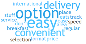
The Busy Parents segment used GrubHub more often than other popular delivery apps, with DoorDash as their second choice and UberEATS third. The word clouds of this user segment for all apps highlighted “easy,” “option,” and “convenient” as the most-used terms when describing what is appreciated in app selection. This outcome highlights this group’s reliance on apps to simplify their frenetic routines. Responses specific to GrubHub emphasize the variety of restaurants as crucial to app choice. In contrast, those who preferred DoorDash noted promotions and incentives as a differentiator. UberEATS fans liked the app’s superior order tracking functionality. Regardless of app choice, Busy Parents show their focus on the happiness of their families. One respondent notes that the “Cheesesteak place we like [is] only on grub hub [sic].” This individual had similar comments about other apps, which shows that users in this segment can jump app-to-app to accommodate their family’s preferences.
Understanding our user segments as best as possible, as well as their challenges, were our priority. In order to learn more, we built an online survey and shared it in various relevant communities. As a team, we developed 15 questions that we felt would give us the right information without overwhelming users. In just a few days, we received approximately 30 responses. We utilized the information we received to determine which parts of the app needed the most focus, according to users.
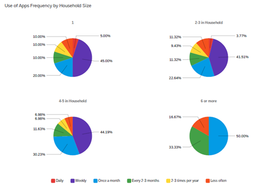
Before reviewing GrubHub’s usability, the team identified two heuristic frameworks to identify issues. The Nielsen/Norman framework of “10 usability Heuristics for Interface Design” was the most-used framework for this analysis. Additionally, since much of GrubHub’s interface centers around the search interface, User Focus’ “247 Web Usability Guidelines” provided supplementary heuristics for this type of functionality. Lastly, the concepts from Norman’s “Design of Everyday Things” underpinned the research to provide further considerations for assessment.
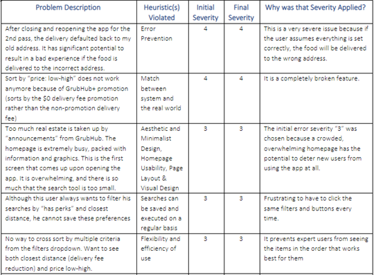
The team recognized over forty heuristic violations in the use of the GrubHub app. These issues were identified using a combination of empathetic role-playing using five different user scenarios based on the user segments identified earlier in our research and individual usage of the app without a specific user segment in mind. Each issue was assigned a severity level scaled 0 – 4, where 0 was the least intrusive to usability or user experience, and 4 was the most. The severity assigned considered the user segment being studied and the context of the error. After individual heuristic evaluation, the group combined all issues found into a single list. We then identified issues that were repeated between users or overlapping in concept. These duplicates were combined to create a single record for analysis and discussion.
During the next phase of the project, we conducted user interviews to build new personas and to inform our final recommendations for the app. Together with the team, we prepared an interview script with 23 open-ended questions, focusing on our targeted users’ motivations, and habits while using the app, and personal insights. Each team member recruited and conducted two interviews. We referenced the user interview findings throughout the rest of the design process. My personal research objectives during the interview phase were as follows:
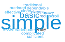
21 out of 26 young professionals cited a modern app interface as “moderately important” or “extremely important” to them while using food delivery apps. While the color of the apps did not fall far behind, with 18 out of 26 citing this being moderately or extremely important to them, the question of if the app is color blind friendly did not seem important to young professionals, with only three indicating this feature as extremely important. When asked what other aesthetic features were essential to them, respondents mentioned user-friendliness and well-organized and intuitive navigation. While the young professionals did not have any significant complaints about the app’s aesthetics, as shown in the word cloud, most young professionals think the app has simple aesthetics.
We wanted to form a deeper understanding of our users' goals, needs, experiences, and behaviors. So, we created 2 personas each, with all categorized under one of our user segments. They were based on user interviews and surveys, in addition to current literature about creating personas and scenarios, and were created in Canva. We used these personas to help us "step out of ourselves" and reconsider our initial ideas.
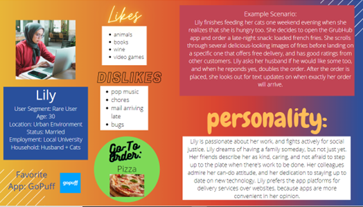
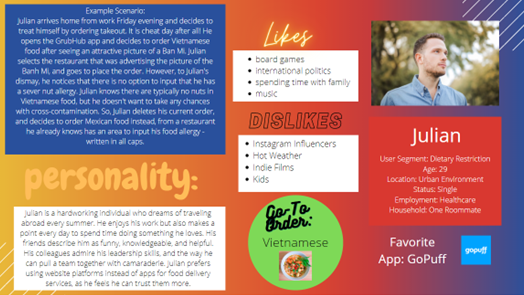
There is a lot of potential to take this project even further - we would have loved to interview more users, including others of user segments that were not specifically covered here. It would have been really fun to take this to the next level and produce wireframes, and eventually prototypes based on what we learned (specifically what users had to say about the design elements of the app). Funnily enough, the day we finished our final presentation, GrubHub relaunched with a completely new homepage and logo design. It's almost like they read our minds!
The biggest learning takeaway from this for me personally was interviewing skills. This was my first time doing a professional interview, and everything Dr. Hernandez discussed with our team about interview Do's and Don'ts came into live play. It was a big learning experience, but one I'm very glad to have been able to add to my professional toolkit. This was also my first time using Otter.ai, the recording software that will auto-transcribe everything during an interview. Otter is now the primary tool I use when conducting user interviews.